Tooltester is supported by readers like yourself. We may earn an affiliate commission when you purchase through our links, which enables us to offer our research for free.
According to Squarespace, its templates are “award-winning”. But that could mean anything, really. It could even just be marketing mumbo-jumbo.
So I decided to investigate.
A few Google searches later, I found the truth: Squarespace has actually been shortlisted and won a few Webby awards, including one for the best visual design.
I have to admit that I’m not completely surprised. Squarespace has long been the gold standard when it comes to sleek, polished template designs for your professional website.
As our full review of the website builder notes: “hardly any other company understands how to stage its product with such perfection. Everything looks cool, fresh and impeccable”. You only have to take a look at some examples of real Squarespace websites to see that their websites really stand out.
With its latest 7.1 release, Squarespace’s templates work a little differently – but that doesn’t mean they’ve compromised on quality. In fact, Squarespace’s templates are now more versatile than ever.
However, the version 7.0 templates also have a few advantages – and, amazingly, they’re still available to use. So, let’s explore the differences between the two versions, to help you decide which is better for your website.
How Many Squarespace Templates Are There?
One of the first things I’m after when rating templates is a good selection. But as someone who has wasted hours of my life going through hundreds of WordPress templates, I can also tell you that too much choice can be a pain.
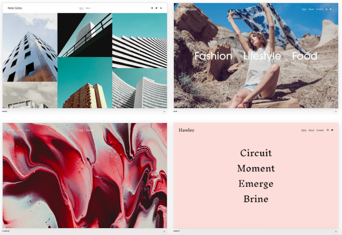
So the first great news here is that Squarespace seems to hit the right spot. Both 7.0 and 7.1 each offer around 110 templates, available in the following 15 categories:
- Portfolios
- Photography
- Online Stores
- Blogs & Podcasts
- Professional Services
- Local Business
- Community & Non-Profits
- Events
- Weddings
- Entertainment
- Memberships
- Restaurants
- Personal & CV
- Real Estate & Properties
- Launch Pages
It’s a manageable number. But if you do the math, that’s not many templates per category. However, you’ll find that each template is flexible enough to be modified for multiple purposes – especially with the latest 7.1 release.
Online store template
Whether you’re selling fashion, home goods, or pet products, there are key fundamentals that make a good online store:
- Easy to navigate
- Prominent call-to-action buttons for transactions
- High-quality photos and videos to showcase your products
- Clear shipping and return information
- Ratings, reviews, and other social proof for building trust
We like the Alameda template for e-commerce sites because it’s a no-frills, flexible way to sell your products. It’s a great template regardless of whether you are still building your brand or already have it established.
Its minimalist, modern layout makes your products stand out, so you don’t need to have a fancy logo, videos, or other brand content ready before launching your store. However, you still need good-quality photos of your products, of course.
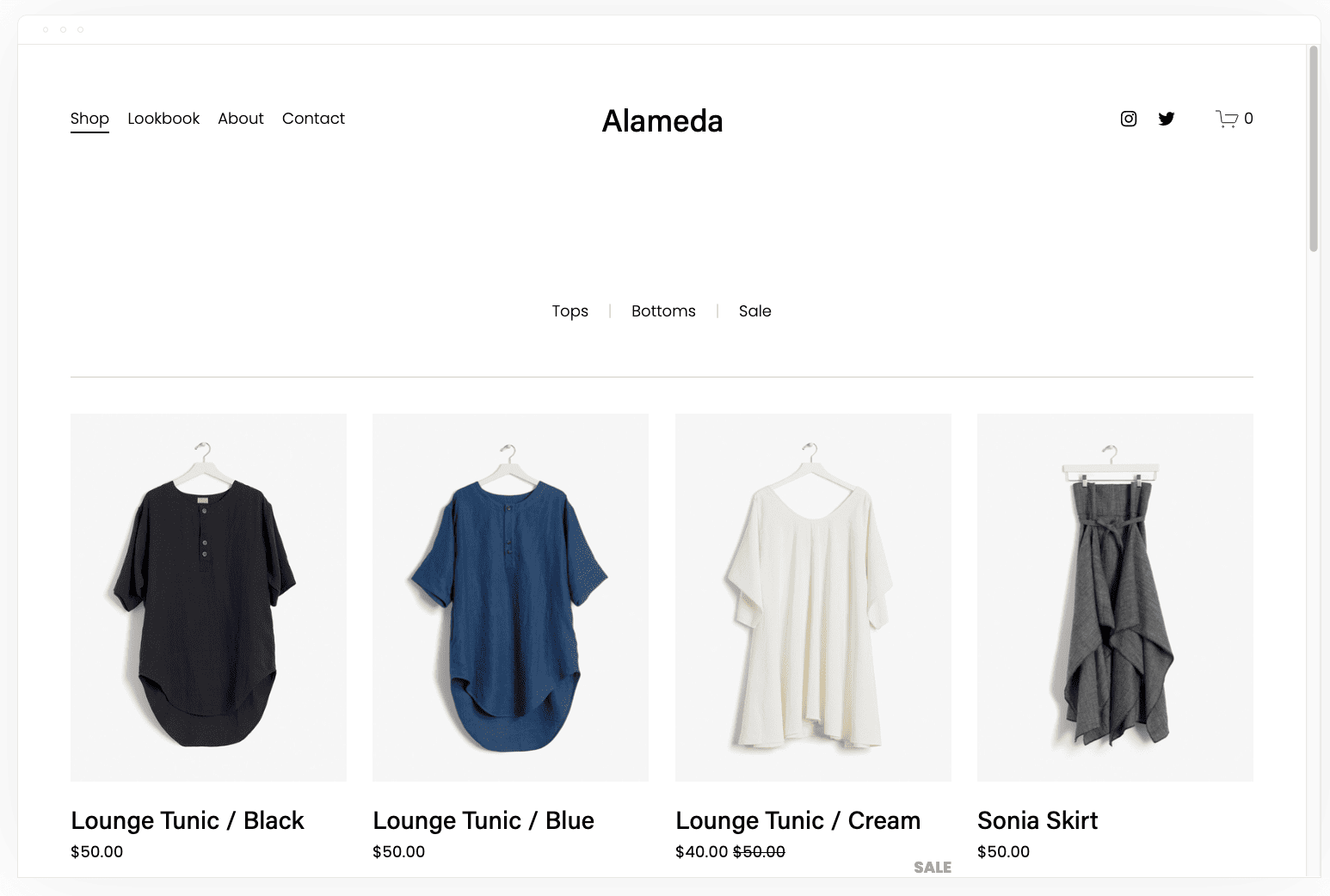
What’s more, we like how easy it is to shop in an Alameda-themed store, which is important because you’d want to remove barriers that make it difficult for your customers to shop. With Alameda, customers can see other product photos by hovering over a tile. You can also mark items for sale and show price drops, which help create a sense of urgency.
You can easily assign products to different categories and customize your navigation to make it easy for people to browse.
Portfolio template
Portfolios are important for creatives, whether you’re working with visual, written, or physical goods. A good portfolio should showcase your personality and philosophy while being simple enough to let your work speak for itself. Clients will only spend a few minutes looking at your portfolio so you should get your message out clearly and efficiently.
We mentioned the Tepito template earlier, and we like it for portfolios because it offers a nice balance between text and visuals. For an even more visual template, we recommend the Ortiz template. With this template, you can include introductory text about yourself and a gallery showcasing your work in visual form. If people want to see more of your bio or portfolio, they can choose using the easy-to-navigate menu at the top of the page.

It allows plenty of space between visuals and text to let the eye rest and appreciate the content.
Blog template
A well-designed blog showcases your recent posts so people can tell that your site is updated regularly. People are unlikely to subscribe to your blog newsletter or peruse your content if they can’t tell when it was last updated. It also needs to incorporate visuals, so your posts attract readers. You can be an excellent writer, but you’ll still need high-quality photos to get people’s attention.
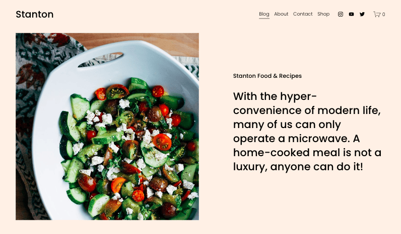
We like the Stanton template for blogs. Stanton lets you add a blurb that tells people about your blog, along with an image. When people scroll down, it shows your recent posts in gallery view along with preview text, an image, and a date. The example here is for a recipe blog, but the template is excellent for travel blogs, photography, health, or design blogs.
Business scheduling templates
Online scheduling is so important for businesses and independent consultants. A website with well-designed booking features (such as an online calendar) eliminates the need for potential clients to call or email and wait for a response from you. It also stops the need to go back and forth when figuring out availability. The easier it is for people to schedule calls, the more likely they will do it.
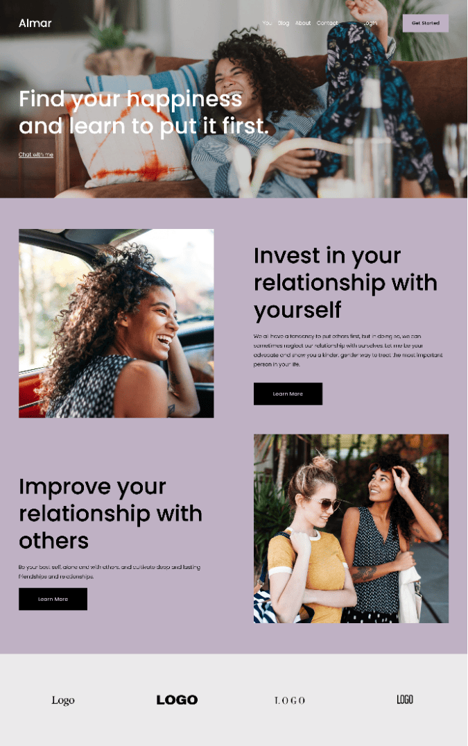
We love the Almar template for businesses and consultants because it has an easy-to-use online scheduling tool. It also lets you add easy-to-navigate areas for telling people about the different services you offer. You can even add sections for client logos and testimonials to build trust with potential clients.
Landing page templates
Sometimes, you don’t need a whole website for your service or business. This is usually the case when you have a single event, product, or service and you just want people to sign up for it. A single landing page is also a good way to “park” a website that hasn’t launched yet. Oftentimes, it’s better to have a landing page than to have no online presence at all.
Your landing page has to be visually interesting, easy to use, and give people a sense of urgency. The best templates for landing pages let you add large, exciting images, essential information about your event or product, and a clear call to action, whether it’s RSVP-ing, signing up, purchasing, or just contacting your business.
Your call to action doesn’t have to be a button. It can be a message telling people to do something. Your landing page can also link to other information about your business, such as a parent page or an Instagram profile.
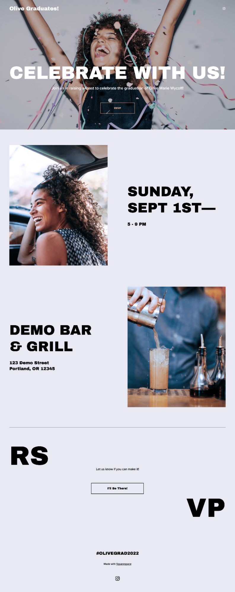
We like the Wycoff template for landing pages because it has all these elements. The site’s purpose is unmistakable, and the call to action is hard to miss.
Best Squarespace Templates and Families in Version 7.0
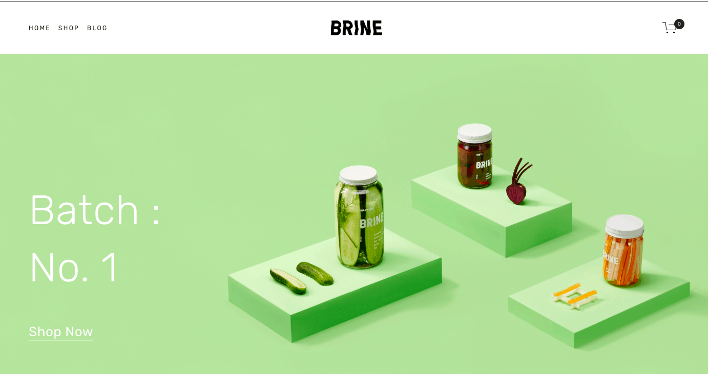
If you decide to go for a version 7.0 template, a good place to start is the Brine template family. It’s the most popular and flexible one, used to build over 40 templates. It has an Advanced Products Page, parallax scrolling, and a stacked Index Page.
Here is the original Brine template in action, which is the base for an online store that sells pickles. Now I don’t know about the business potential, but the design looks great.
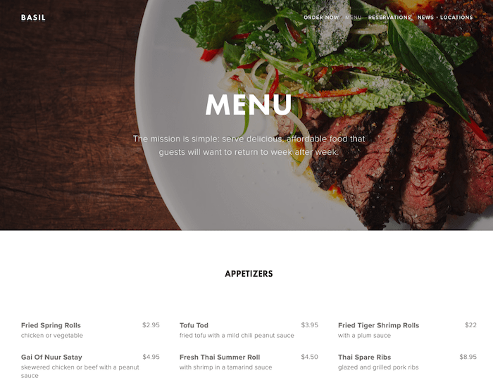
But here’s the magic of template families: here is Brine completely transformed into a Restaurant website called Basil. Below is the menu page, which uses a “collection page” to add items.
And here it is again, transformed into a template called Hatch, which would work great for a personal website or freelancer portfolio page.
Here are more examples I really like:
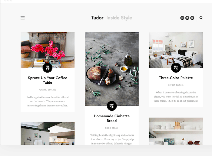
Great Squarespace Blog Template – Tudor
I mean, just look at that. Tudor is a magazine style, clean, 3 column layout (which can be adapted), nice modern typography, minimal social media icons. It makes me want to start a blog just to play with this template.
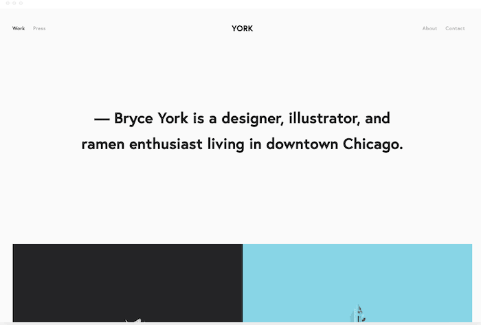
Great Squarespace Template for a Portfolio – York
York is used here for a designer, but anyone who creates with visual media can make their work shine. The pictures take center stage, and you get more info when you hover over them, perfect for a quick project descriptions or case studies.
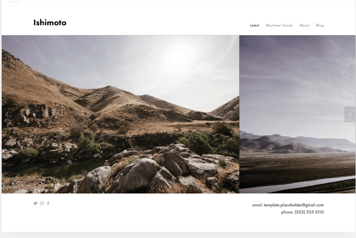
Best Squarespace Template for Photographers – Ishimoto
I really like how this Ishimoto theme lets you highlight one big picture and allows users to quickly navigate a gallery thanks to the carousel. It’s minimalist, effective, and beautiful. Tip: find more information on photography website builders here.
Is There a Difference Between ‘Templates’ and ‘Themes’?
No.
They’re the same thing but with a different name. Squarespace themselves call them templates, not themes. But… there’s also the template families.
Wait, What Are Squarespace Template Families?
Good question. The first thing to understand here is that template families is a term that’s really only relevant to version 7.0. It’s simply a group of templates that share the same underlying structure.
Why does this matter? Well, it just means that some styling options will only be available in certain template families.
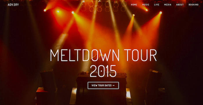
So for instance, in version 7.0, the templates Adversary, Alex and Ginger are all based on the Marquee family. Some unique features of that family are:
- Site header can be fixed at the top while scrolling
- Logo size can’t be changed
- Sidebar isn’t supported
- Parallax scrolling works on banners
The Adversary template, used for a band website
That’s no longer important in version 7.1, however, because all templates belong to the same family. So, you’ll have the same options for designing and styling your site, no matter which template you choose.
Which leads us to the next important point: how to choose the right Squarespace template:
How Should I Choose a Squarespace Template?
Choosing a Squarespace template can be tricky (especially when you have so many gorgeous designs to choose from!), but you have a number of tools at your disposal to help make the process a little easier:
- Make use of the categories (Online Stores, Portfolio etc) to help you filter your choices down. Can’t find a template you like in your category? No problem – as all templates can be adapted to any purpose, simply choose a template that has a similar look and feel to what you want for your site, regardless of the category
- Be sure to preview templates before you settle on one (you can even fully demo it to get an idea of what a live site would look like). This is really important, as you won’t be able to switch your template later (if you’re using version 7.1)
With Squarespace version 7.1 templates, it’s fairly easy to change up your layouts, thanks to the ability to add in pre-built sections. So I’d recommend choosing a template based on styles (fonts, colors etc) rather than layout, as it takes more work to make stylistic tweaks than structural ones.
If you’re using a version 7.0 template, remember that your styling options are dictated by your template’s family. That means you need to consider how you want your site to behave when choosing a template. Do you want to list your blog posts in a grid? Do you need a content sidebar? How about navigation links in the footer?
I know it sounds a bit overwhelming, but luckily Squarespace has a handy template comparison chart for v7 templates here.
Squarespace Templates in Version 7.1
What’s really great about the approach that Squarespace has taken in version 7.1 is that all templates have the same underlying structure and styling options. That gives you a good amount of freedom to customize your templates as you’d like – something that was painfully lacking in version 7.0.
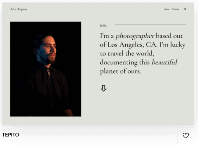
So for example, you might start out with an ultra-minimalistic, text-only template like Suhama (ideal for CVs and personal sites):
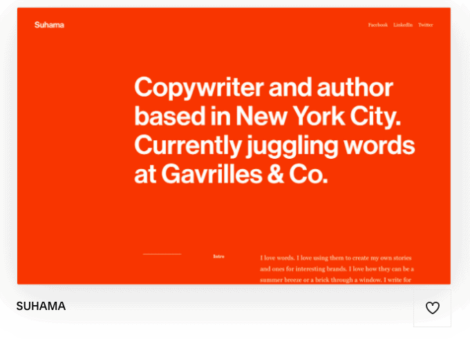
And make adjustments (insert new sections, change font and colors etc) to end up with a more visually rich template like Tepito:
In fact, Squarespace’s version 7.1 templates are so versatile that you can modify any of the following elements:
- Fonts (font families, spacing, height etc)
- Colors (thanks to Squarespace’s customizable color schemes and palettes)
- Buttons
- Animations
- Spacing
- Custom CSS
- And more
All of these elements can be customized in the Design menu – check out our Squarespace tutorial to learn more.
With over 100 templates to choose from in Squarespace 7.1, picking the right one can be overwhelming. We’ve chosen our favorite templates in each category. We hope you’ll find the right template for you, whether you’re starting a blog, online store, portfolio site, or landing page.
How Much Customization Do I Get With Version 7.0?
As you’ve seen with the Brine family, you can completely transform your template by moving elements and using the standard customization options. This is all done through the Site Styles.
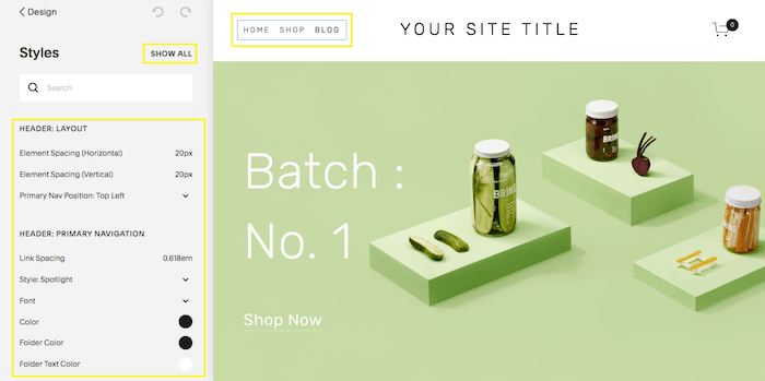
Site Styles example with the Brine template
Site Styles will let you modify things like:
- Typography: (font family, color and size)
- Sizes and values (for padding, spacing, etc)
- Images aspect ratio
- Background image
- Showing and hiding elements
- And more…
After making the changes, you can decide undo or save them. If saved, they will appear live on your site.
But if you want even more customization options, you’re in luck because Squarespace also offers:
- Blank templates: choose a blank website template instead of using a demo with its content, this could give you more creative control.
- Custom code: Yes, you can add HTML or CSS to create a completely really custom website. But you’ll need the Business plan to do so, and support won’t help you if something goes wrong (until you remove the custom code).
- Premium features: depending on your Squarespace plan, you can add premium features such as the aforementioned code blocks, JavaScript injection, and more.
A final thing to note: when you sign up for a free Squarespace trial, all the Premium features are automatically enabled. However, you will lose them if your plan doesn’t support them later.
Are Squarespace Templates Mobile-Friendly?
By default, yes. All Squarespace templates are designed to be responsive, so the elements will rearrange themselves to look good on screens of any size.
However, in version 7.0 you have the option to tweak a few elements, in case you need to make the site play nice. For instance, see how the title on this Mojave theme is too big for a small screen?
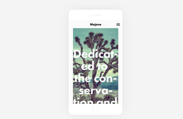
The title might need to be shortened or resized manually for mobiles
Also, you can make your site even mobile-friendlier by following a few tips and tricks.
How Much Do Squarespace Templates Cost?
That’s an easy one: they’re all free. You only pay whatever your Squarespace plan costs.
But you can also purchase tailor-made templates directly from external designers. These tend to hover around the $100-300 mark.
What are the Differences Between Squarespace Templates in Version 7.0 and 7.1?
When you sign up for a new Squarespace website, you’ll automatically be presented with Squarespace’s newest templates (version 7.1) to choose from:
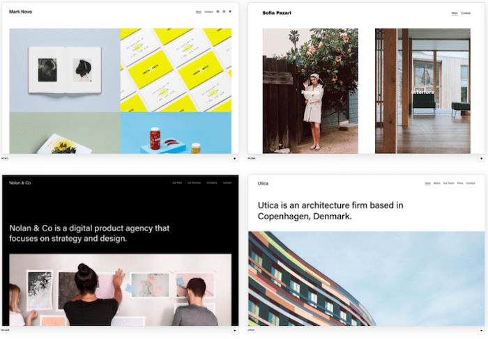
However, if you scroll down the page, you’ll see an option to choose from its earlier version 7.0 templates instead: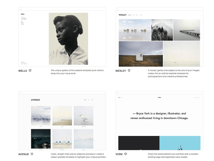
Visually, there’s not a huge difference between the 7.0 and 7.1 templates – both versions offer stylish website designs that reflect Squarespace’s unique brand of minimalism.
Functionally, however, there are a few key differences to be aware of. In my opinion, the most important one is that Squarespace 7.1 templates use the same base template, meaning that no matter which template you choose, you will have access to the same layout and styling options as any other template.
Plus, version 7.1 offers over 100 pre-built sections (headings, text, images, galleries and more), which can be added to any page. That ultimately gives you greater control over your site’s design.
Let’s break these differences down into greater detail:
| Feature | Squarespace Version 7.0 | Squarespace Version 7.1 |
|---|---|---|
| Templates | Allows you to switch between templates, even after you’ve already started using a template | Doesn’t allow template switching. However, you have greater control over your template layout and design, meaning you can completely overhaul your template if needed (see next row) |
| Styling | Fonts, colors and styles are defined by template – your options to customize them are limited. Adjustments are made on a page-by-page basis. However you have the option to edit HTML, CSS and JS on Squarespace’s Business plan | All templates have the same style and layout options, so you have more freedom to customize. Adjustments can be made on a section-by-section basis, and Squarespace’s Fluid Engine editing system lets you drag and drop content wherever you like. As with 7.0 you can also inject custom code if you have a Business plan |
| Mobile responsiveness | All templates are mobile-responsive. Some 7.0 templates allow you to specify your own styles for displaying certain elements on mobile (e.g. font, logo size, navigation bars) | All templates are automatically mobile-responsive. You can also customize the mobile version of your site without it affecting the desktop design. |
| Blog | Layout options are limited, and determined by the template you choose (e.g. list or grid display) | You get greater control over the layout, as all templates offer the same options (grid, single column, masonry display and more) |
| Online store | Uses ‘Product Pages’. Maximum of 200 products, and uses category navigation without dropdown menus. Features such as quick view, image zoom and waitlists only available with some templates | Uses ‘Store Pages’. Maximum of 10,000 products, and uses category navigation with dropdown menus. Greater control of layout as you can add sections to Store Pages. Quick view, image zoom and waitlists available with all templates |
| Image galleries | Offered through ‘Gallery Pages’. Display options limited to two layouts only | Uses ‘Gallery Sections’ instead, meaning you can add these to any page. More versatile layouts available (strips, masonry, reel etc) |
| Development Platform | Allows you to build a custom Squarespace site from scratch. Only recommended if you have technical expertise and need a custom site | Not currently available for Version 7.1 |
Can I switch from a Version 7.0 Template to a 7.1 Template?
Unfortunately there’s no way to change from a version 7.0 Squarespace template to a 7.1 template. If you have an existing site built with a 7.0 template, the only way to upgrade to 7.1 would be to manually rebuild your site. That means recreating the layout and copying and pasting over the existing content.
Can I Find Squarespace Templates Elsewhere?
Yes, as noted above. Just search for “Premium Squarespace templates” and you’ll come across a few developers who specialize in selling custom Squarespace designs. Ideally, these companies can directly install the template into your Squarespace account (if you have an existing Squarespace site).
Be aware though that many templates require the use of the Squarespace Developer Platform – and this is currently only available for version 7.0. For version 7.1, you can also buy Squarespace template kits on some websites that come with step-by-step setup instructions (you basically use their artwork and build the design in Squarespace yourself). This seems like a complex roundabout way, but could be useful if you want to independently change your site later.
Important thing to note: if you simply copy and paste the code yourself, it will fall outside of the scope of Squarespace support.
As to other pros and cons of a Premium Squarespace template? I’d say the main advantage is that your site will stand out from the crowd. Even with all the customization options, you’re likely to find more and more sites that look a lot like yours.
But it can also be expensive, especially if you need to purchase changes later on. Sure, there will be a flat fee for the premium template, but you’ll be tied to the developer’s code, and they might not offer unlimited support.
Conclusion: Pros and Cons of Squarespace Website Templates
There is a lot to like about Squarespace templates – and even more so with version 7.1. The website design is impeccable, as expected, but the customization and range also appear to give just the right amount of choice without being overwhelming.
Pros of Squarespace Templates
- Stylish, and aesthetically pleasing
- Decent selection
- Good flexibility and customization options (especially with version 7.1)
- You can add custom code
However, I can understand how some people would want more customization options or choices. In that case, I would probably recommend you look at Wix (flexible enough to place everything manually from the editor), Weebly (which lets you tweak the code to your heart’s content), or even Webflow (which provides you with complete control over your site’s design, without the need for any coding).
Cons of Squarespace Templates
- Advanced customization might require premium features
- They rely on big, beautiful images. If your content isn’t as high quality, the templates quickly look less attractive
- Templates are customizable, but still based on rigid grids. You don’t get full control over elements like with other, more flexible builders.
And that about covers it. Anything else you’d like to know about Squarespace templates? Let me know in the comments below.
We keep our content up to date
14 Nov 2022: Added new template examples
11 Apr 2022: Smaller updates
29 Jan 2021: Updated to reflect version 7.1 changes
THE BEHIND THE SCENES OF THIS BLOG
This article has been written and researched following a precise methodology.
Our methodology