Tooltester is supported by readers like yourself. We may earn an affiliate commission when you purchase through our links, which enables us to offer our research for free.
So you want to build an online sneaker store. Good choice. Our research tells us that sneakers are trending in 2022, although sneaker culture was popular since Nike came out with Air Jordans in 1985. The right pair can take you from day to night and from work (wherever that may be) to play.
Pros of building a sneaker site with the Shopify platform
It might seem intimidating to build an online store, but platforms like Shopify make things easier, as no coding is needed. With over a million businesses (big and small) globally on Shopify, it’s one of the leading e-commerce platforms in the world. In our extensive testing, we’ve found that Shopify has everything you need to set up and customize your store without coding or design skills.
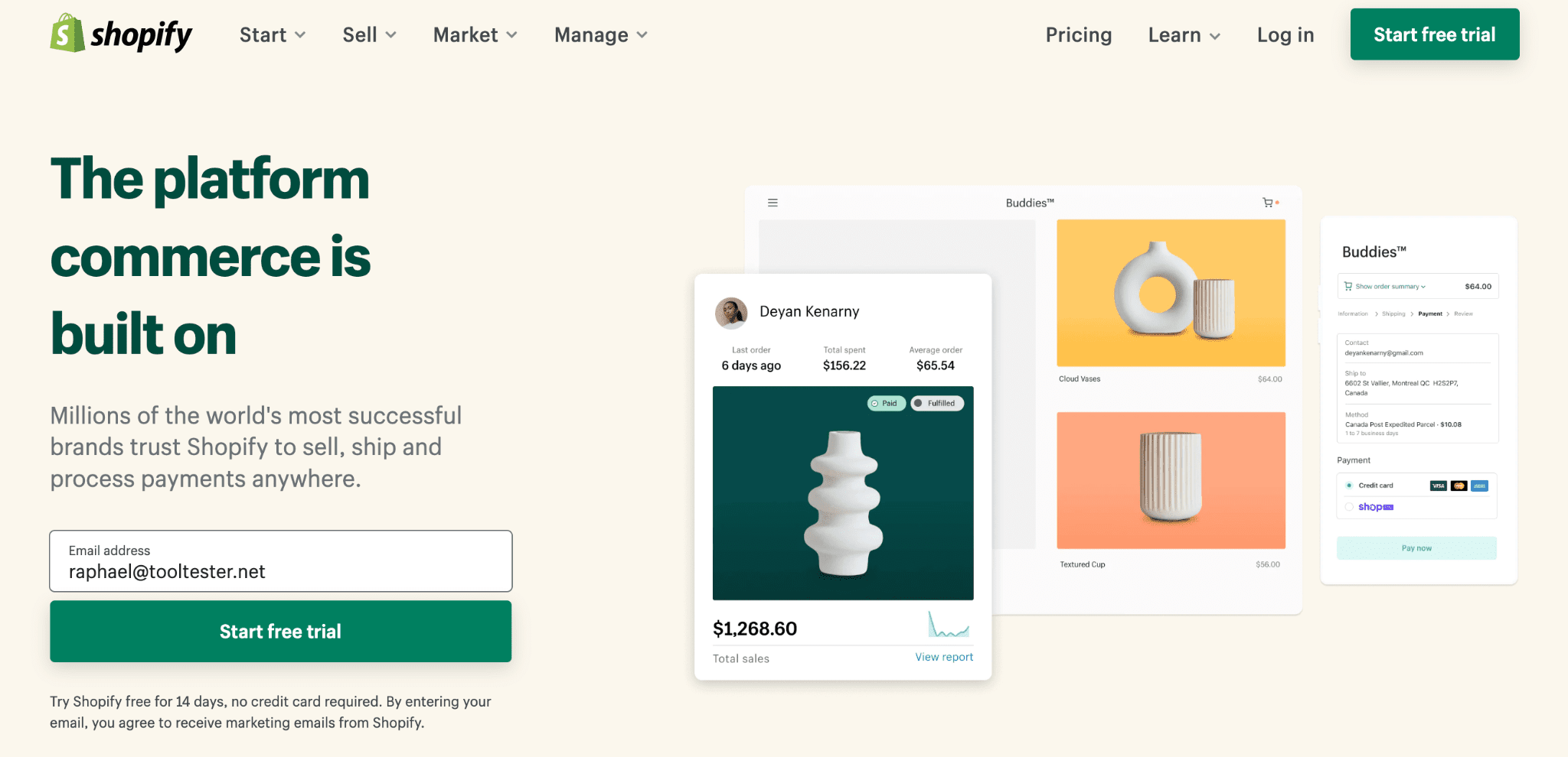
Even the lowest tier plan offers a ton of features, including lots of customizable themes to choose from, the ability to delegate tasks to staff, and point-of-sale services, in case you want to sell in person at fairs or pop-up stores. Shopify also offers third-party integration and additional sales channels so you can integrate your store into Facebook, Ebay, and Amazon.
All these features make Shopify one of the more flexible and versatile platforms, capable of growing with your business. We have a full review of Shopify if you wanted to learn more.
All you need is inventory and a bit of inspiration, which we’ve researched and gathered here. We’ve also researched similar themes for each site (some of which are even free), so if you find a style you want, you don’t have to design your Shopify sneaker site from scratch.
And so, here’s our list of some of the best-performing Shopify sneaker stores:
1. Hanon Shop
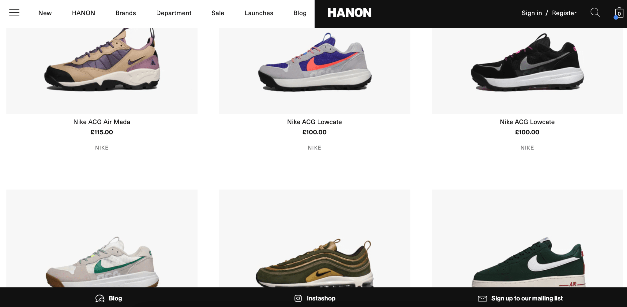
First in our Shopify sites list, Aberdeen-based Hanon was founded by brothers, Edward and Brian Toft, at their parents’ house in the late 1980s. Fast forward over 20 years later, it has become one of the leading Shopify stores for skater-inspired kicks and streetwear in Scotland.
Shopify has made it possible for people in some countries to order from Hanon without ever stepping foot in their online store. Their online store, Hanon-shop.com, gets around 67.6K visits a month, our research shows. So what lessons can we take from Hanon in building our Shopify sneaker store?
Pros of this Shopify store:
- Visual appeal: Hanon’s uses a minimalist design with a lot of white space to really showcase their shoes. Since you want your sneaker designs to stand out, use a minimalist design to showcase your styles.
- Product details are easy to read: every shopper (whether online or in-person) wants to see the brand, available sizes and colors, and of course, the price. Hanon shows these important details up front in the gallery view, so people can quickly compare. There’s a lot of competition for your shopper’s attention, so don’t make them have to dig around for these details.
- Easy to navigate: the website has a clear universal navigation and layout, meaning it’s easy to figure out how you’d get around on the website. Hanon does this by displaying a consistent menu on every page. With that said, the navigation’s not perfect. We’ll get into that in the next section.
- Customer account: Hanon lets customers register for an account on the site so they can view their order history. When a customer adds items to their cart and abandons the session, the items stay in their cart rather than expiring. Enabling customer accounts also lets you email customers who’ve abandoned their carts.
- Multiple payment options: It’s important to have different options, especially if you’re selling internationally. Hanon lets customers pay by credit card, Shop Pay, Google Pay, and Paypal.
Cons of this Shopify site:
Admittedly, there aren’t a lot of cons to Hanon’s design. I did notice a couple of problems that we can all learn from:
- Inconsistent navigation: while the placement of the universal navigation provides a good experience, clicking on “Launches” takes you to a different experience. The “Launches” section has a different navigation and layout than the rest of the Hanon site. Having an inconsistent experience can be disorienting to shoppers, so try to keep your site patterns consistent. If you must take people to a different experience, give them a heads up.
- Confusing category names: do you know the difference between “Shirting and polo tops” versus “Track shirts and sports tops” versus “Tees”? If you do, you’re probably in the minority. It’s possible that Hanon is targeting a specific audience (ones who are experienced in this sports culture and understand the lingo) but it’s good practice to consider folks who are brand new to this skater and sports culture. It’s also good to consider folks who want to look at track shirts and tees at the same time. Why make them go through the extra clicks? I would recommend combining these specialty categories into a broader “Tops” category and adding filters so the experts can narrow the list down however they want.
- No payment installment plan: offering an installment plan can increase conversions by making your products more affordable, especially to a younger demographic.
- Shipping and returns policy is hard to find: it’s a good idea to put this in your footer or universal navigation, where people can get to it easily, so you can build trust with your customers.
- No live chat: customers feel reassured if they see that they can reach an agent if they have questions.
- No language switcher: customers can only view the site in English, as far as we can tell.
Now that we’ve looked at the pros and cons, you’re probably wondering how you’re ever going to build a sneaker site like Hanon’s. To help you get started, we’ve identified a Shopify theme that’s similar to theirs.
URL: hanon-shop.com
DR: 56
Average monthly traffic: 67.6K
Similar Shopify theme: Beyond
2. Notre Shop
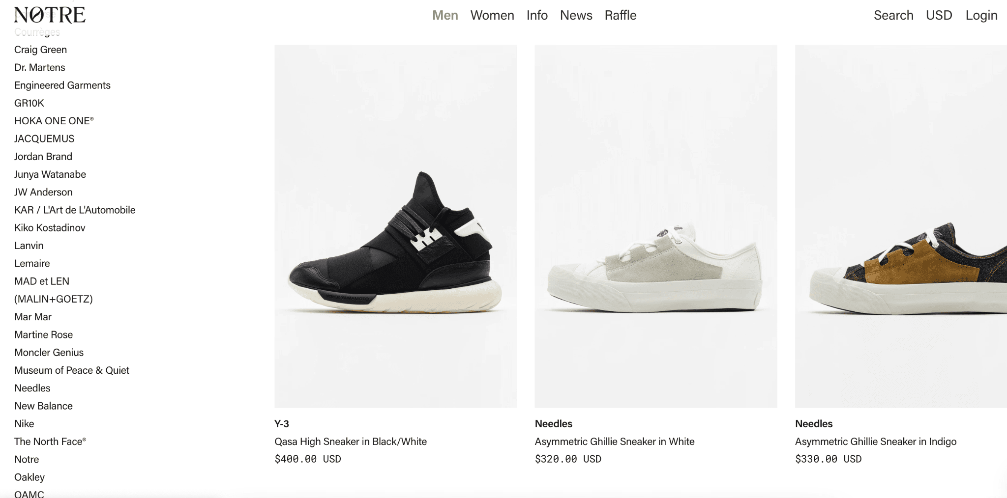
Notre is a shop based out of Chicago. It was founded in 2014 by business partners, MJ Jaworoswki, Jose Villanueva, Andrew Nordstrom, and Charlie Nordstrom. According to our research, Notre hired architects to design their store to be more like a skate park-inspired event space. In a past interview, Villanueva said they get most of their sales on their website, so they’re not too concerned with selling at their brick-and-mortar stores. “We live in a very busy city,” he said, claiming that they want their in-person stores to make a statement and nurture their community rather than being about sales.
Since the Notre online shop is successful at selling, what lessons can we learn from them? We’ve taken a close look at their design.
Pros of this Shopify store:
- Visual appeal: while the home page is packed with imagery and very little white space, once we got to the shoe category, we noticed a minimalist and simple approach. In fact, Notre used much bigger tiles with empty space around the product to showcase their shoes.
- Easy navigation: the universal menu is easy to find and the labels are intuitive. You can drill down by product category or brand once you click a top-level one.
- Product details are easy to find: it’s easy to find the brand, model, and price while scanning the gallery. Hovering over the product tile also shows you the available sizes.
- Customer account: Customers can sign up for an account and view their order history.
- Payment options: Notre offers credit card payment options, as well as installment plans through Affirm and Sezzle, so more people can afford to buy from them.
- Shipping & returns policy: this is right in the footer, where it’s easy to see. Making this information accessible builds trust with customers.
- Chat/messaging option: customers can live chat with a representative directly on the site.
Cons of this Shopify store:
- No quick-add: while the product details make it easy to choose a product directly from the gallery, there’s no way to add it to your shopping cart from that view. You still have to click through to the product detail page and add it to your cart. According to UX principles, adding this extra friction to a person’s shopping experience makes it more likely that they’ll abandon the page.
- No language switcher: customers can only view the site in English.
URL: notre-shop.com
DR: 52
Average monthly traffic: 48.8K
Similar Shopify themes: Be yours
3. Undefeated
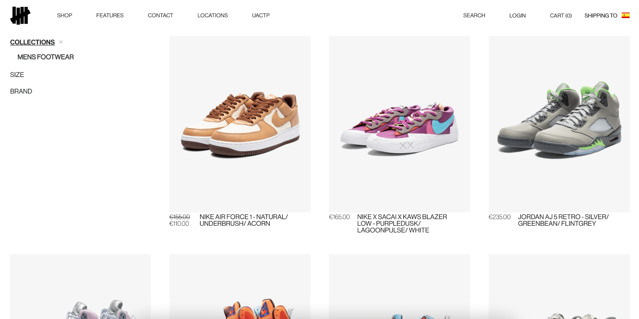
Undefeated is a sneaker boutique founded in Los Angeles by Eddie Cruz and James Bond (you read that right) in 2004. Undefeated is known for its collaborations with Nike, Vans, and other big sneaker brands, but don’t let that intimidate you as a new store owner. Instead, here’s what we’ve learned from them.
Pros of this Shopify store:
- Visual appeal: Like many other sneaker stores we’ve listed here, Undefeated uses white space and a clean design to make its sneakers stand out.
- Product details are easy to find: the brand, model, colors, and price are clearly displayed in gallery view so you can quickly scroll through them and compare.
- Easy navigation: In addition to a universal navigation and search, it’s easy to filter by category, size, and brand on the left column. The filters themselves have an issue, which we’ll get into shortly.
- Instant checkout: Undefeated offers instant checkout through Shop Pay (Shopify’s own accelerated checkout service), allowing customers to save their shipping and payment details so they can check out just by entering a confirmation code.
- Payment options: Undefeated allows customers to pay via credit card or Shop Pay with the option to pay in installments.
- Visible shipping and terms: this important information is in the footer where, research shows, customers expect it.
Cons of this Shopify store:
- Limited filtering: the filters on the left won’t let you choose multiple categories, sizes, or brands. This is an inefficient experience for a customer who’s interested in looking at multiple brands or sizes at the same time.
- Product details are harder to read: while the product details are visible, the lack of structuring makes them hard to skim. Try to use varied formatting to visually separate the brand, model, and color, so people can easily process that information.
- No language switcher: the online store is limited to English only, which hinders global sales.
URL: undefeated.com
DR: 58
Average monthly traffic: 172K
Shopify stores theme: Dawn
4. Glue
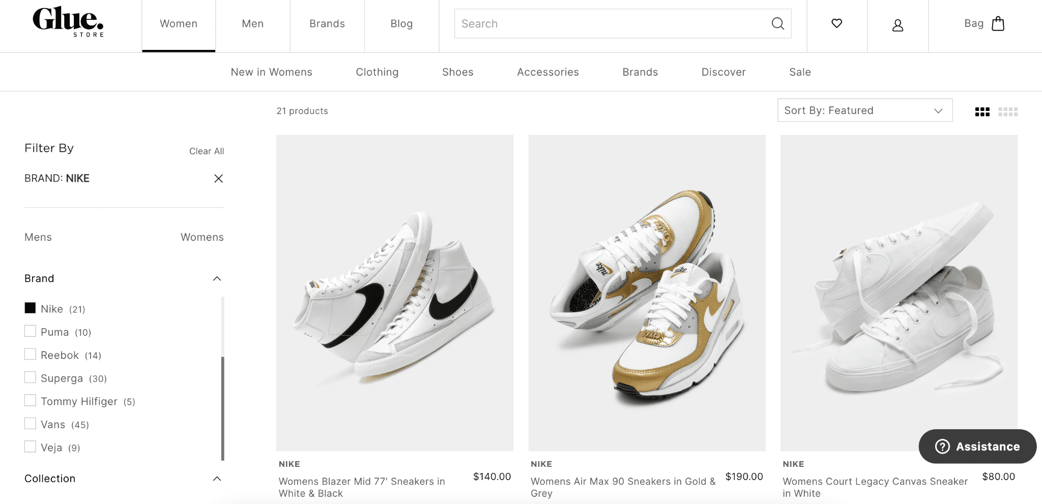
Glue is an Australian-based store that’s been around for at least two decades. While they carry major fashion brands, they also put equal importance on Australian designers.
Pros of this Shopify store:
- Visually appealing: Glue also uses white space and a minimalist design so the focus is on the product.
- Easy to navigate: the universal navigation clearly gives an idea of what’s on the site, and allows customers to jump from one section to another.
- Easy to find product details: the brand, model, price, and size (on-hover) are clear from the gallery page.
- Easy to find shopping cart: when you add a product, you can immediately see the shopping cart that gives a running total of your items.
- Customer account: customers can create an account and view their order history.
- Chat option: customers can quickly reach an agent if they have any questions or need help.
- Shipping and returns policy: this is in the footer, so customers can find it easily.
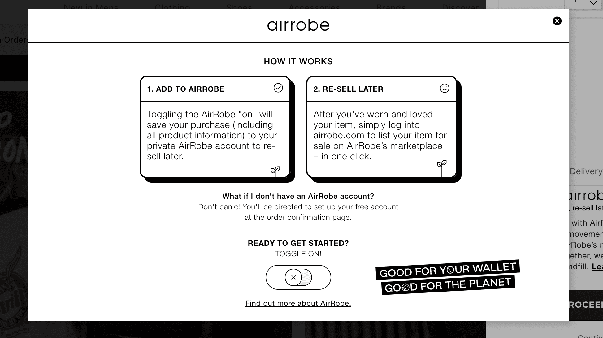
- Option to resell later: the shop has partnered with Aiirobe to allow customers to add their purchase to the Aiirrobe records so they can easily resell the shoes later. This is a great option for folks who want to change their style frequently.
Cons of this Shopify store:
- Faulty categorization: while it’s useful to have filters, your filters are only as good as your tagging or categorization. When a customer clicks on the men’s footwear, for instance, the filters on the left show “women’s footwear”, which can be very disorienting. Your filters have to be consistent with your category to avoid frustrating shoppers.
- Cart expiration: there are mixed opinions about whether it’s good to have a shopping cart expire. On one hand, it creates a sense of urgency so the customer will hesitate less in making a purchase. On the other hand, if a shopper were taking a while to browse, they might just lose the things they were planning to purchase. We side with the latter.
- No language switcher: the site is only in English, so it’s harder for non-English speaking folks to purchase from it.
URL: gluestore.com.au
DR: 60
Average monthly traffic: 200K
Similar Shopify stores theme: Responsive
5. WeTheNew
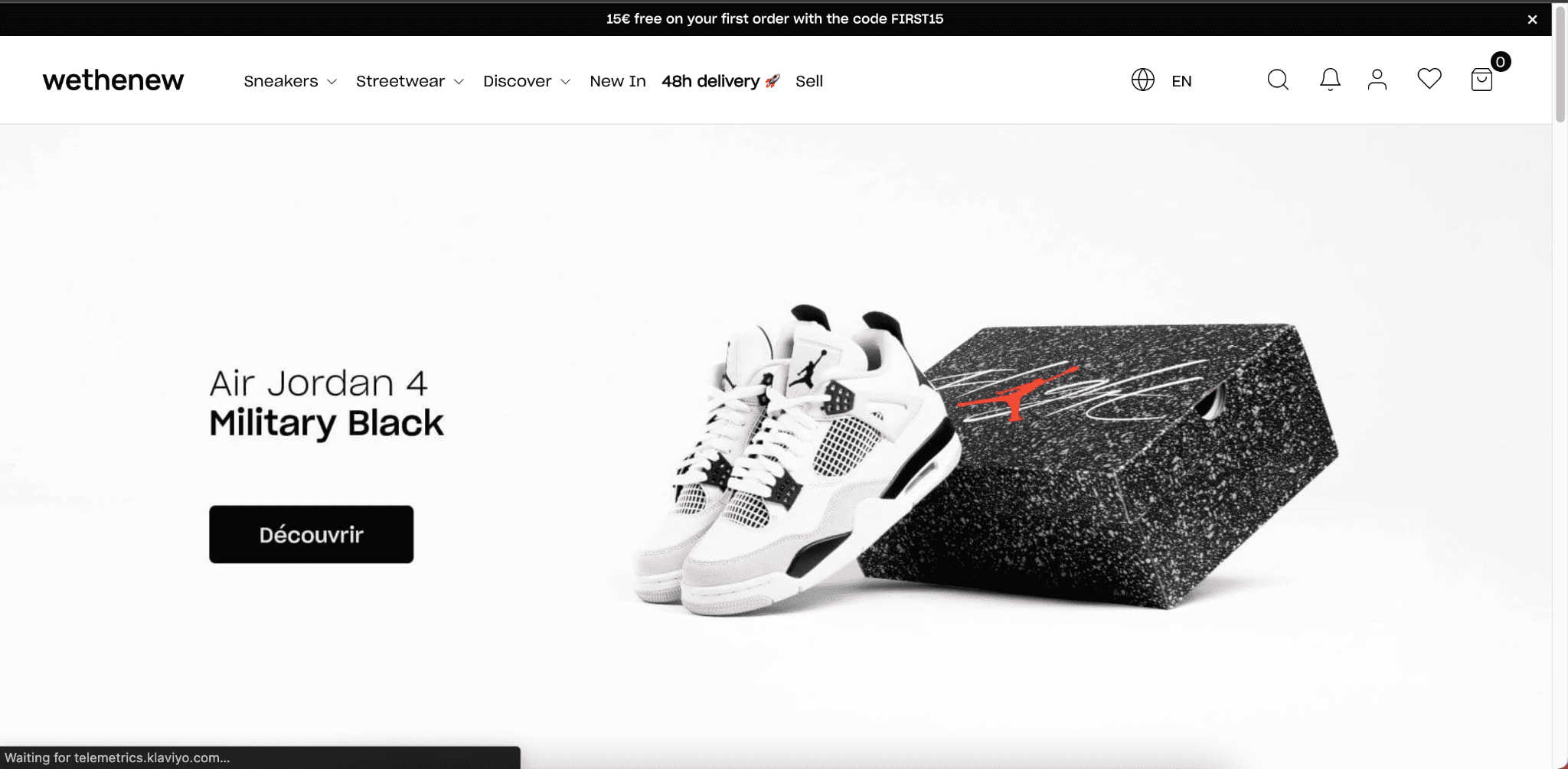
WeTheNew was founded in Paris in 2018, by two self-proclaimed sneaker enthusiasts, David and Michael.
Pros of this Shopify store:
- Visual appeal: while not as trendy or modern as many other Shopify stores in this article, WeTheNew offers a similar gallery view with white backgrounds to make the sneakers stand out.
- Easy to navigate: the universal navigation is straightforward and consistent on every page.
- Product details are easy to find: you can see the price, brand, and model directly from the gallery view, so it’s easy to compare.
- Customer account: customers can create accounts to view their history.
- Multiple payment options: customers can pay via credit card, Paypal, LayBuy, Afterpay, Zip, or Openpay with options to pay in installments or buy now and pay later.
- Returns policy and shipping information: this can be easily found in the footer, where most people expect it.
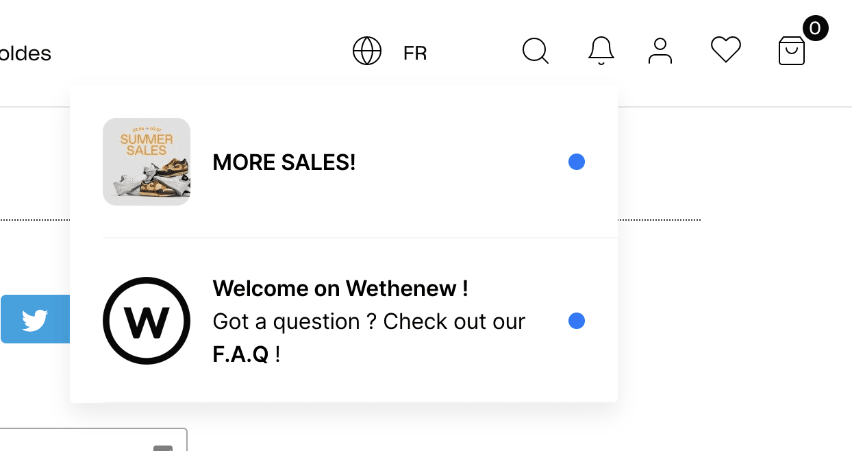
- Easy language switcher: being located in France and in close proximity to other countries, it’s great that the language switcher at the top makes it easy to switch from French to five other European languages. This can be enabled using Shopify Market’s multilingual features
- Alerts: customers are notified of what’s new on the site or what content they might find helpful.
Cons of this Shopify store:
- No quick-add: there’s no way to add products directly from the gallery view.
URL: wethenew.com
DR: 70
Average monthly traffic: 2.6M
Similar Shopify store theme: Influence
6. AFEW Store
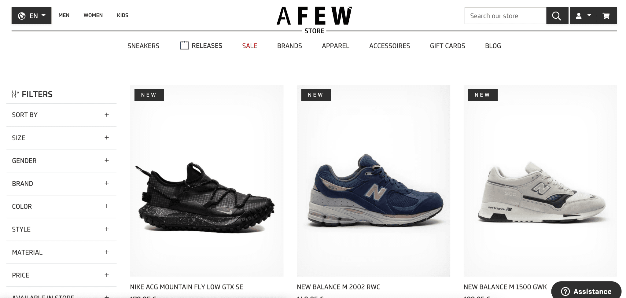
Düsseldorf-based AFEW was founded in 2008 by brothers, Marco and Andy, out of their father’s garage. While it is now an internationally-known high-end sneaker store, the owners still consider it a family business.
Pros of this Shopify store:
- Visual appeal: AFEW has a minimalist design and lots of white space to showcase their shoes.
- Product details are easy to find: the brand, model, and price are right on the gallery page.
- Customer accounts: customers can create an account to view their order history or track delivery status.
- Payment options: customers have the option to pay by credit card or do an express checkout through Amazon Pay, Paypal, or Google Pay.
- Chat option: live chat builds trust among customers, and this online shopping store puts a button on the site so customers can reach someone.
- Shipping and returns policy: having these in the footer, where it’s easy to find, is reassuring to customers.
- Easy language switcher: it’s easy to switch from English to German.
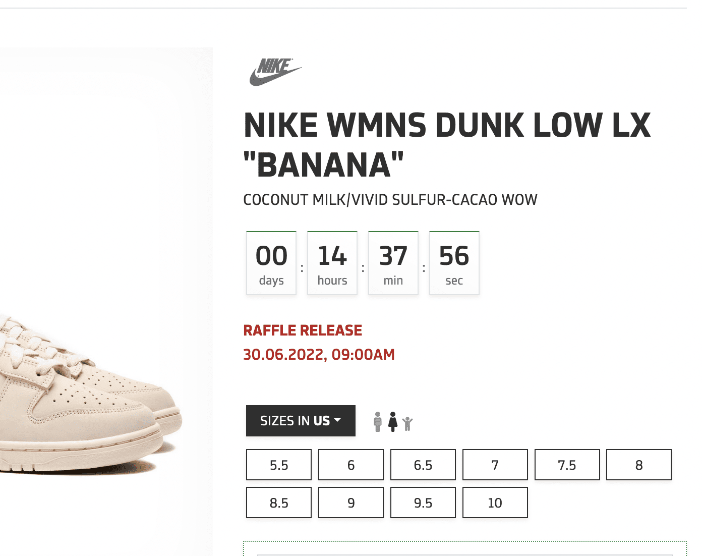
- Raffles: Customers can enter raffles right from the product page. There’s even a timer to give people a sense of urgency.
Cons of this Shopify store:
- No quick-add: AFEW requires an extra click to add items to your cart. You can’t add items directly from the gallery.
- Navigation is confusing: the universal navigation displays an overwhelming number of categories and the flyover format covers up almost the entire screen.
URL: en.afew-store.com
DR: 57
Average monthly traffic: 32.3K
Similar Shopify theme: Warehouse
7. Men’s Luxury Boutique
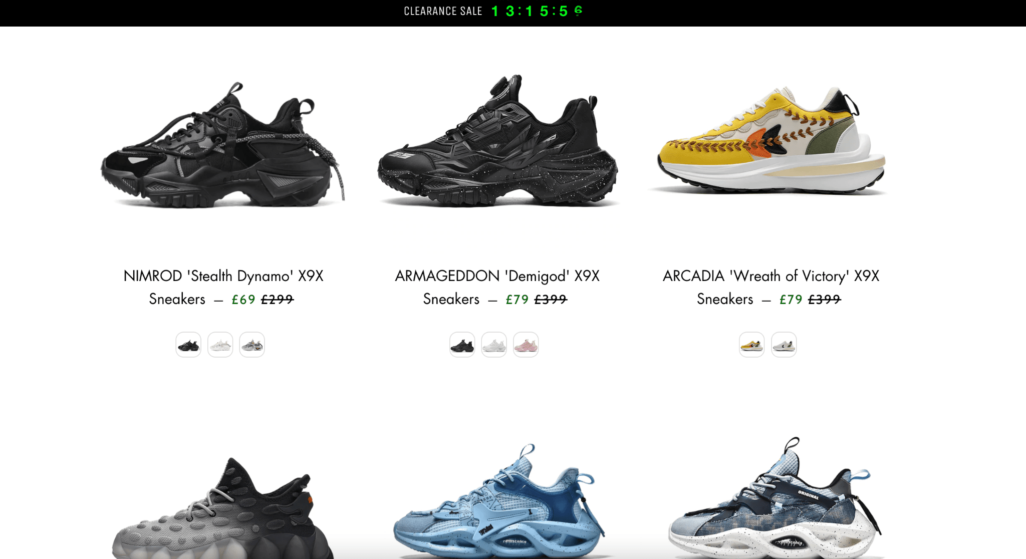
London-based Men’s Luxury Boutique boasts sneakers with futuristic and innovative designs. Their website doesn’t say much about the company’s origins, but there’s a large focus on their social media presence.
Pros of this Shopify store:
- Visual appeal: the layout is clean and minimalist which lets the bold shoe designs stand out.
- Clear product details: it’s easy to see brand, model, price and color at a glance.
- Customer accounts: customers can create accounts and view their history.
- Payment options: customers can pay by credit card or Google Pay.
- Shipping and returns: this information is in the footer, so customers can find it easily.
Cons of this Shopify store:
- Confusing navigation: the homepage is quite confusing because a large portion of the screen is dedicated to their Instagram gallery and you have to scroll down to actually find the Shopify store. The menu is tiny as well and you have to go hunt for it.
- No quick-add: adding a product to your cart requires an extra click.
- No ‘pay in installments’ option: customers with less funds are unlikely to buy here if they don’t have the funds upfront.
- No language switcher: customers are limited to viewing the site in English only.
URL: mensluxuryboutique.com
DR: 26
Average monthly traffic: 2.9K
Similar Shopify theme: Highlights
8. Kicks Crew
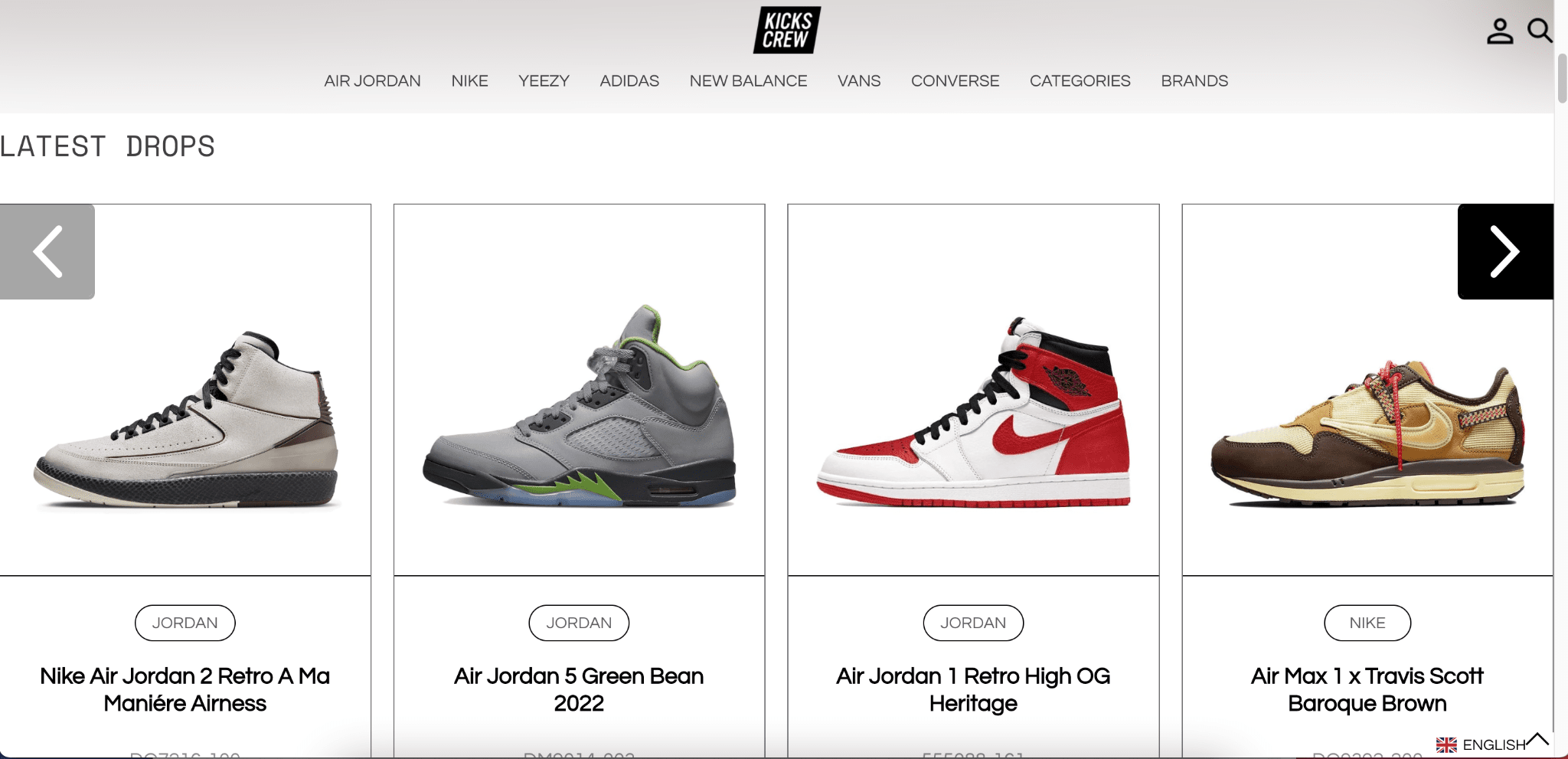
Kick Screw was founded in 2008 by Jonny Mak and Ross Adrian Yip in Hong Kong, with the goal of making anyone find their special pair regardless of their budget, preferred brand, or purpose. The team originally sold their sneakers on other platforms, like eBay, Amazon, Tmall, and JD, but they’ve shifted to a direct-to-consumer model in 2021. We’ve found out that the company has secured $6 million in Series A funding and is set on expanding to North America with its new Los Angeles headquarters.
Pros of this Shopify store:
- Visual appeal: lots of white space on their site so your eye can focus on the shoes.
- Easy navigation: the universal navigation helps you find your way around the site, no matter what page you’re on. The top-level categorization breaks logic a bit since they show some popular brand names alongside “Categories” and “Brands”, but we’ve found that many successful online retailers will feature what their customers are the most interested in at the time, even if it breaks the rules a little.
- Product details are easy to find: It’s easy to see the brand name, model, price, and even the model number.
- Customer accounts: customers can view their order history and add items to their wish list.
- Wish lists: surprisingly, not a lot of Shopify sites had this feature. A wish list lets customers keep track of shoes they want to buy later.
- Multiple payment options: customers can pay by credit card, Paypal, Affirm (in installments), or Klarna.
- Easy language switcher: while the site automatically detects what language you’re using based on your system language, it’s easy to switch to another language using the drop-down menu.
- Shipping and returns information: this information is in the footer, so customers know what to expect before they purchase something.
Cons of this Shopify store:
- No quick-add: if you’re already set on the item you want to purchase, you can’t add it from the product list.
URL: kickscrew.com
DR: 54
Average monthly traffic: 1.3M
Similar Shopify theme: Boost
9. Kikikickz
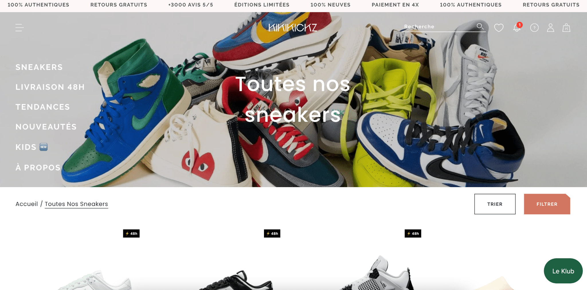
Paris-based Kikikickz was founded by two friends, Baptiste Saltiel and Killian Dris, who first started re-selling hard-to-find designer sneakers online in 2016. Now they have a physical store in the first arrondissement, catering to celebrities and private customers.
Pros of this Shopify store:
- Visual appeal: the online store has an appealing hero image that feels stylish and dynamic. On the actual product gallery, the style is minimalist with white space so your eyes are drawn to the shoes themselves. There’s also a scrolling banner, which could easily be distracting or outdated, but they’ve done a good job of making it a seamless part of the site because its colors blend in.
- Easy-to-find product details: you don’t have to guess what brand, model, or price a shoe is. It’s easy to find in the product gallery view. There are even “badges” that tell you how much you would be saving if a shoe were on sale.
- Customer accounts: customers can track their order history and change addresses as needed.
- Favorites: customers can add items to their favorites list and revisit them later.
- Payment options: customers can pay by credit card, Paypal, or break their payments up through Alma.
- Alerts: customers can see what’s new and exciting on the site, including sales and promotions.
- Live chat option: a chat button on the site makes it easier to reach an employee.
- Shipping and returns are in the footer: people can access information on when to expect their item and how to return something.
Cons of this Shopify store:
- Hard to navigate: It’s not easy to find the universal navigation, which is tucked away in a little menu. While the product details page has breadcrumbs, it takes you back to the home page, rather than allowing you to view all related sneakers.
- No quick add: you have to click on the product details page to add a shoe to your cart.
- Difficult to switch languages: the site is in French, and if you want to see it in another language, there’s no visible way to do it.
URL: kikikickz.com
DR: 55
Average monthly traffic: 1.2M
Similar Shopify theme: Spark
10. Secret Sneaker Store
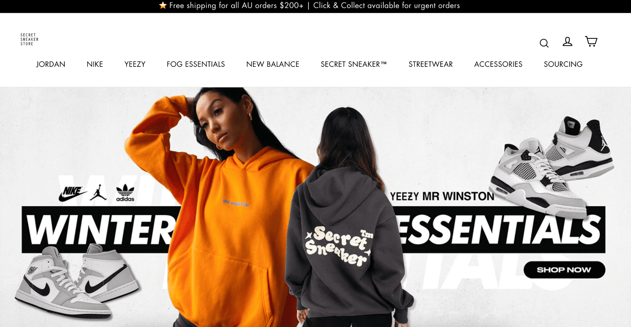
Secret Sneaker Store was founded in Australia by Edwin Low. Low got inspired to sell in-demand sneakers online after looking at Zappo’s online store but he didn’t have the capital to start a store, so he decided to try a consignment model. While the physical stores sell used, but pristine, rare, and cult sneakers, the items in the online store are brand new.
Pros of this Shopify store:
- Visual appeal: the all-white background and minimalist layout make it easy to see what the shoes look like.
- Easy navigation: the folks at SSS know that their audience is interested in brand-celebrity collaborations so it shaped its navigation around that. You can browse by brand and also by specific collaboration. This is where the Zappos influence comes in too: the filters on the left also make it easier to browse by color, price, size, gender, and item type.
- Product details are easy to find: you can easily skim by price, brand, and model right in the gallery view.
- Customer accounts: people can view their order history and manage their contact information.
- Multiple payment options: In addition to offering credit card, Paypal, Laybuy, Afterpay, Zip, NihaohPay, and LatitudePay, SSS even offers YouPay, which lets you send your cart to someone else so they can pay for the item on your behalf.
- Shipping and returns: it’s easy to find their policy on shipping and returns.
Cons of this Shopify store:
- No quick-add: it’s harder to add shoes to your cart from gallery view.
- No language switcher: the site is in English, and as far as we can tell, you can’t switch to a different language.
URL: secretsneakerstore.com
DR: 22
Average monthly traffic: 88.8K
Shopify similar theme: Avatar
11. Kith Europe
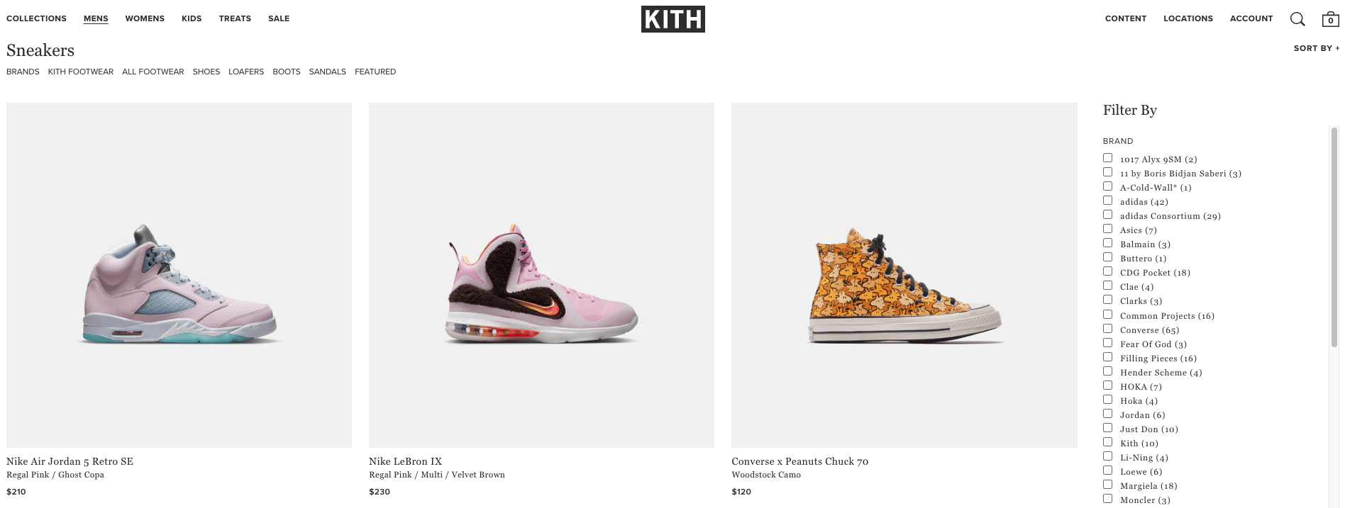
Kith was founded by Ronnie Fieg in 2010 in New York. It has two brick-and-mortar locations, both in New York, but has a global presence through its online store.
Pros of this Shopify store:
- Visual appeal: lots of white space and a minimalist design to bring attention to the shoes.
- Easy navigation: the universal navigation lets you choose from straightforward categories: men, women, kids, treats (food). Once you get to the category you want, there’s another sub-navigation that lets you narrow down by brand and product type. The filters on the right make it easy to refine the product list.
- Product details are easy to find: it’s easy to skim shoes by brand, model, and price from the gallery view.
- Quick-add: when you hover over an item, you can add it to your cart right from gallery view.
- Customer accounts: customers can view their history and manage their contact information.
- Multiple payment options: Kith EU allows credit card and Paypal payments.
- Easy language switcher: you can view the site in English as well as French, with the switch of a button.
Cons of this Shopify store:
- Some confusing labels: while the navigation is mostly good, there are some unintuitive label choices (like content instead of “blog” or “press.”)
- Inflexible payment options: there’s no way to pay in installments or share your cart. Only customers who have the funds upfront can purchase.
- No wish list: since customers can’t add items to a wish list for later, it’s hard to keep track of items they want to buy at some point.
- No live chat option: the button takes you to a knowledge base, which can be frustrating if you have a question that’s specific to your needs.
URL: https://eu.kith.com/
DR: 72
Average monthly traffic: 14.5K
Similar Shopify theme: Galleria
12. Sneaker Politics
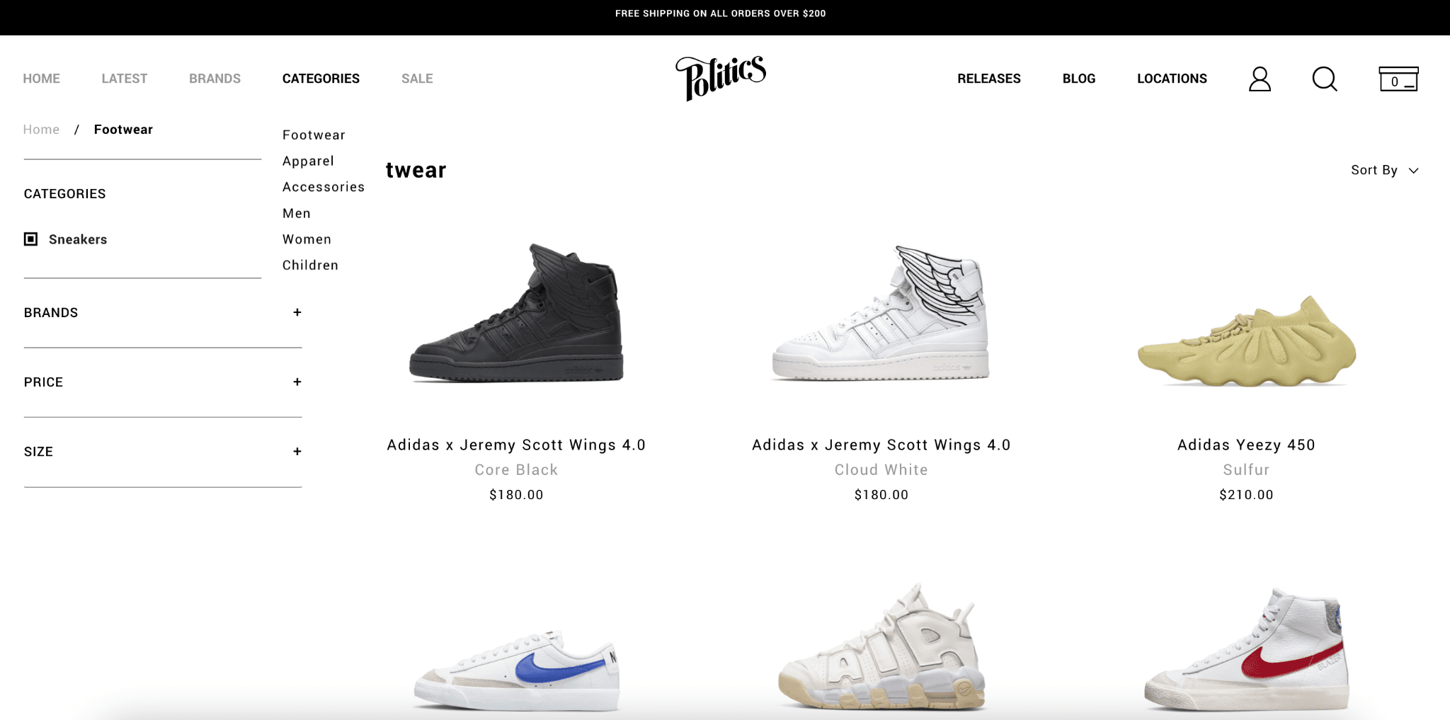
Sneaker Politics was founded in Louisiana, in the United States, by Derek Curry in 2006, after being inspired by how experiential sneaker stores were in the northeastern USA. He wanted to cultivate that experience and community in the American South. Although it took 15 years for him to find that footing, Sneaker Politics has topped $70 billion in sales in 2020.
Pros of this Shopify store:
- Visual appeal: the simple color palette and minimalist design focus your attention on the sneakers.
- Easy to navigate: the site has both universal navigation for people who want to browse, as well as filters so they can refine their choices.
- Easy-to-find product details: the brand, model, and price are right in the gallery view.
- Quick-add: it’s fast and easy to add items to your cart from gallery view.
- Customer accounts: view your order history and manage your addresses easily.
- Flexible payment options: Sneaker Politics offers options for credit card, Paypal, AfterPay, or buy now and pay later with Sezzle.
- Shipping and return policy: this is in the footer where most expect it.
Cons of this Shopify store:
- No with list: Sneaker Politics could potentially lose sales by not offering customers an option to save items for later.
- No live chat: it’s hard to get support quickly if you have a question.
URL: https://sneakerpolitics.com/
DR: 52
Average monthly traffic: 106K
Similar Shopify theme: Icon
Pro tips for building a good ecommerce site
When it comes to building a good online store, minimalism is key. You want your customers to focus on the product, rather than your site’s design, so make your product take the center stage.
You also want to make it easy for people to find important details that would influence their decision: brand, model, size, and price. You can add some little nudges, like a sale badge to let customers know what a deal they’re getting, but don’t obscure the important details.
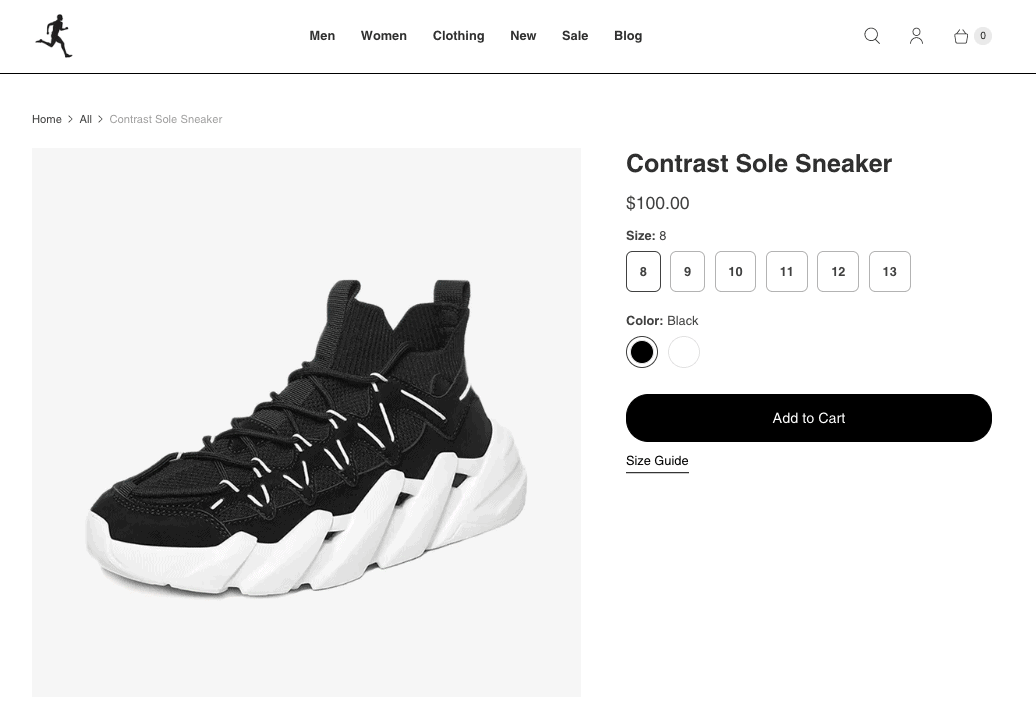
An example of a clear product page built with the Shopify Retina theme
When it comes to shoppers, there are browsers and there are people who know what they want. You’d want your site to accommodate people who are just browsing and those who want to search for specific items or already have a color and style in mind.
Most people don’t purchase right away, so don’t look at browsing as a bad thing. You’d want them to remember how easy-to-use and visually appealing your site is so that they’ll come back. It’s good practice to add a favorites or wish list option to your store so people can save items they like.
Our research has found that even if customers add items to their carts, they abandon their carts for many reasons (distractions, uncertainty, loss of Internet), so it’s important to reel them back in with an email. Shopify has great options for sending emails to people who’ve abandoned their carts, and you can do it manually or automatically.
Conclusion: Building sneaker sites on Shopify
Shopify is an excellent platform for building online stores. Its well-designed templates help you build a modern, minimalist sneaker store that really highlights your product.
Shopify comes with features that make it easier for customers to shop, such as gallery view, product detail view, and an option to add a universal navigation without coding. Shopify also has features that let your customers maintain engagement with your shop via customer accounts, abandoned cart recovery, and wish lists.
For global stores, Shopify lets you integrate different payment options so your customers can choose the ones that work for their situation.
However, while Shopify is one of the leading platforms, some find it expensive or find the fee structures frustrating. Like many website builders, we’ve found that many folks have complained about how hard it is to edit your URL structures to be more SEO-friendly. We did an analysis of Shopify’s SEO capabilities here. If you’re not totally sold on Shopify, you might want to explore Shopify alternatives like WooCommerce and Wix here.
If you like what you’ve seen in this article, however, you can give Shopify a try for free:
> Check our review for more information about Shopify’s pros and cons
> Learn how to start an online store easily
THE BEHIND THE SCENES OF THIS BLOG
This article has been written and researched following a precise methodology.
Our methodology