Website typography used to be a more mystifying design practice than it is today. The complicated process of decorating a web page with custom fonts once required converting and embedding font files to be hosted on the user’s server, and the choice of available fonts was limited to the user’s own collection or knowledge of typography outside of the standard system fonts. As a result, most websites looked nearly identical in their content formatting, which relied on many overused and mundane web safe fonts.
That all changed in 2010 with the release of Google Fonts, an open-source project that allows for far easier implementation of custom fonts on websites. Installing these fonts on your own website is luckily a process that is quick and easy, but you should be aware that not every font combination in Google’s library is a recipe for typographical success. With the right font pairings and usage considerations, however, your online brand can exude professionalism, beauty and reader friendliness without the need for expensive customized fonts. In this article, I’ll show you how to accomplish all this.
A List of 10 Trending Google Font Combinations
Let’s get to it! In no particular order, here are 10 of the best Google Font combinations currently trending:
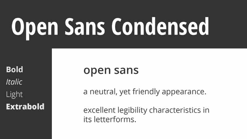
1. Open Sans
Here’s an easy combination that works wonders for nearly any applicable use. Open Sans is one of—if not the—most versatile fonts in the entire collection of Google Fonts. It’s extremely easy to read in large blocks of text, while still being striking enough for headlines.
Simple. Sophisticated. Familiar. You can’t go wrong!
Real-World Use
I can’t foresee any scenario where Open Sans would be a poor choice. Unless you’re looking specifically for a serif font, I think this one will serve most any business, blog, landing page, or web app perfectly.
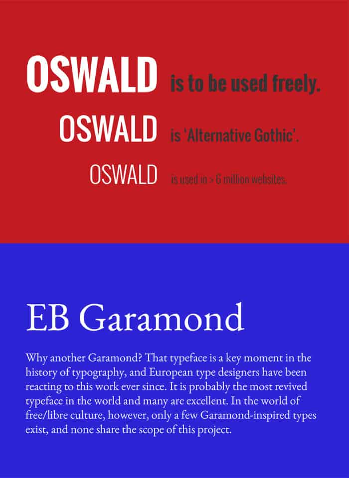
2. Oswald + EB Garamond
Oswald is a great font for headlines no matter the font-weight or use of caps. Its condensed nature helps it grab attention and pop, but it also makes for a pleasantly unique text as your main body’s font.
EB Garamond is an elegant update of the classic Garamond font. Instantly recognizable and timeless in appearance, this font exudes a distinctive professionalism in your typography.
Real-World Use
This pairing works well for professionals dealing with high-end clientele, such as attorneys, real estate agencies, or even upscale boutiques. The versatility of Oswald and the classical look of EB Garamond make for great product description text where it’s important to emphasize an item of premium quality.
3. Montserrat + Merriweather
Montserrat is a favorite among designers for its versatility and simplicity, and Merriweather pairs wonderfully with its contrasting style and easy readability. Feel free to interchange them as headlines or paragraph text—they both work great as either!
Real-World Use
This particular combination is a nice balance of modern and classic design. As such, its variety of uses could support many types of businesses. Personally, I feel these fonts would do well for any type of online news source or publishing agency.
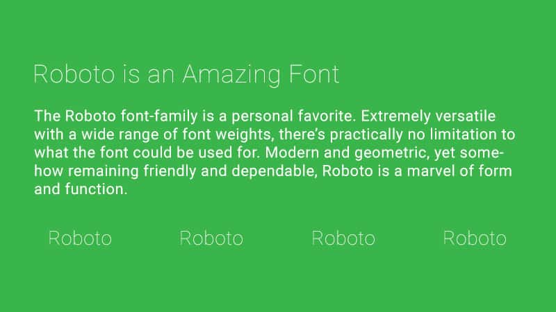
4. Roboto Thin + Roboto Regular
The Roboto font-family is a personal favorite and it’s also one that we use here at How To Get Online. Extremely versatile with a wide range of font weights, there’s practically no limitation to what the font could be used for. Modern and geometric, yet somehow remaining friendly and dependable, Roboto is a marvel of form and function.
Real-World Use
Here’s another pairing that you’d be hard-pressed to find an ill use for. While Roboto works for just about anything, I think it’s particularly great for tech start-ups, modern small businesses, or any type of brand with an eye to the future.
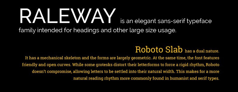
5. Raleway + Roboto Slab
It’s our friend Roboto again! This time, however, we’re looking at the serif variation, Roboto Slab. It’s a font that is just as versatile as its cousin, yet a bit more classical in style. When paired with the distinctive and bold Raleway, we have an amazing match of clean and refined typography.
Real-World Use
Raleway is one of those fonts that screams sophistication. When used as an all-caps headline, I think it works beautifully for luxury items like jewelry, designer clothing, or similarly upscale ecommerce products. Roboto Slab supports it well with simple and approachable descriptive text.
They both work interchangeably as well. Try different weight variations for both fonts in the headlines and body text and see which pairing captures your brand the best.
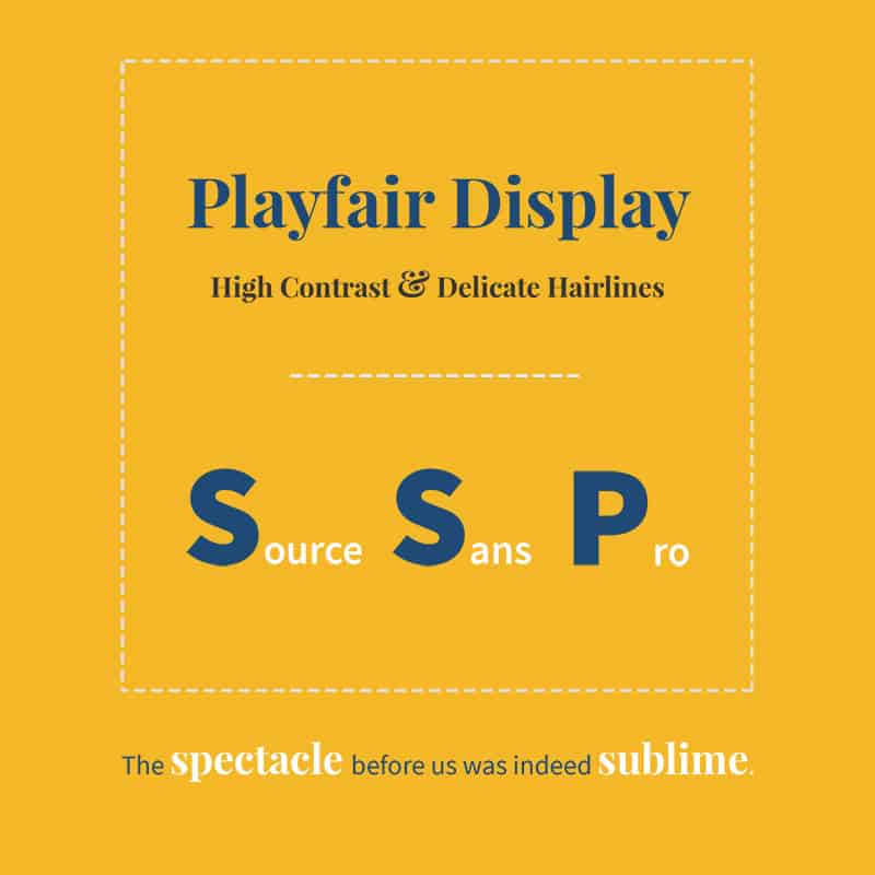
6. Playfair Display + Source Sans Pro
According to its designer, Playfair Display was inspired by the letterforms of the 18th century during the transition from quills to steel-tipped pens. It’s no surprise then that this font exudes old world charm but with a modern spin.
Source Sans Pro pushes things a tad further into the future, creating an intriguing combination that is ornate while still being utilitarian.
Real-World Use
Playfair Display adds a personal touch to something like a tagline or product description. If you have a chance to use its ampersand or currency symbols, you’ll immediately see why it’s the perfect choice for a product or service centered around luxury and appearances. Source Sans Pro keeps the text grounded in a modern and clean presentation.
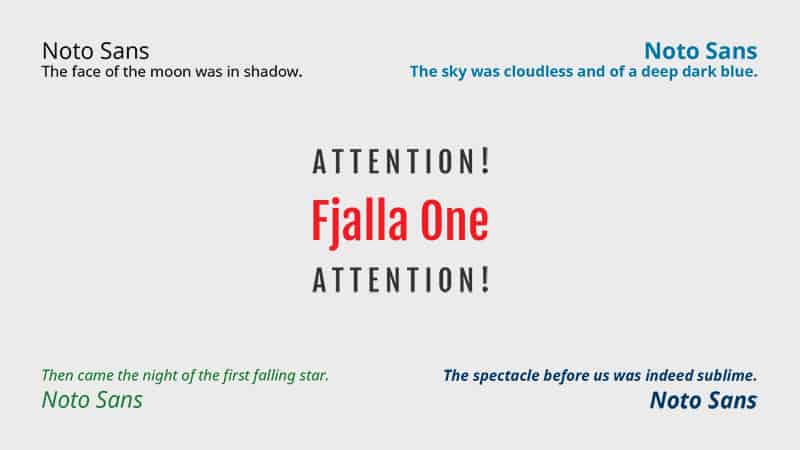
7. Fjalla One + Noto Sans
Fjalla One may not be the most versatile of fonts, but one thing it does extremely well is create headlines that demand attention. Small or large, lowercase or all caps, those letters are hypnotic no matter what you do with them.
Noto Sans aims to be a truly universal font where, no matter the language, it can be displayed without formatting errors for users across the world. Appropriately, the font’s aesthetic is equally as versatile as its utility.
Real-World Use
Blogs or landing pages would be great for this pairing—or really anything with long bodies of text that require noticeable subheadings to break up content. The universal adaptability of Noto Sans also makes it a good choice where reaching an international audience is a priority.
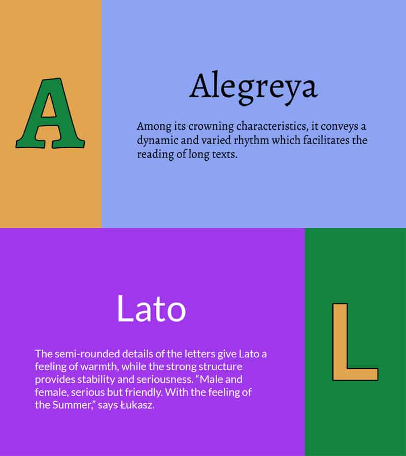
8. Alegreya + Lato
Alegreya has a certain appeal that feels very “earthy” and friendly to me. There’s no pretense about its personality; what you see is what you get.
Lato could give Open Sans a run for its money as the champion of all-purpose fonts in Google’s library.
Together they make for a combination that is fun, easy to read, and pragmatic.
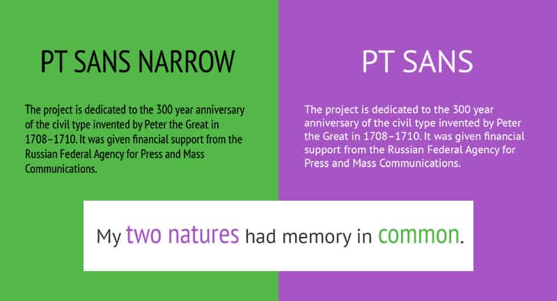
9. PT Sans Narrow + PT Sans
Another modern take on an Old World styling, PT Sans and its brethren, PT Sans Narrow, make an immediate and unmistakable statement when paired together.
Real-World Use
Either font works equally well as a headline or body text; the particular pairing you choose will depend on the nature of your words—though I tend to prefer PT Sans Narrow in shorter bursts.
Intended as a “very important tool for modern digital communications,” it appears most suitable to—though certainly not limited to—use these fonts for tech startups, software applications, or other digital businesses.
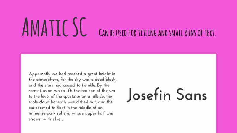
10. Amatic SC + Josefin Sans
Okay, this one’s definitely more on the light-hearted side. Obviously this combination won’t work for everyone, but the whimsical nature of both Amatic SC and Josefin Sans create something that is sure to stand out—just as long as you exercise caution!
Real-World Use
If you’re a fun-spirited artist, actor, musician or entertainer then this font could be essential in capturing your unique personality. Depending on the overarching tone and subject matter, this combination could work for a niche blog as well.
A word of advice: Do not use Amatic SC as your main body text. You will drive your readers insane.
Bonus: 5 of Our Favorite Premium Fonts
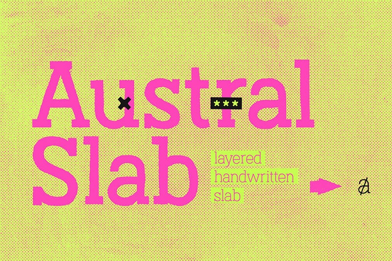
We know this article is about the best, trending Google fonts, but we also wanted to mention a few of our favorite premium fonts as a bonus. Premium fonts, of course, aren’t free – but they do give your website a more unique and custom design. These fonts aren’t popular or trending and are indeed the opposite from the ones we listed above. However, these are great for those who want a custom and personalized design for their brand and do go well when used for logos or even creative headings:
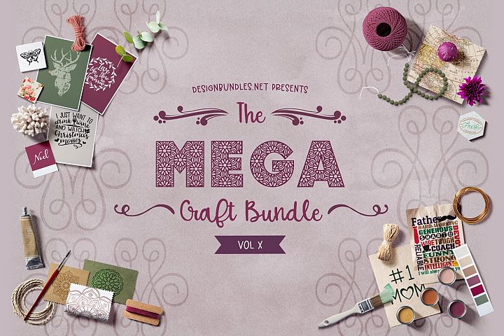
Bonus 1: The Mega Craft Bundle X
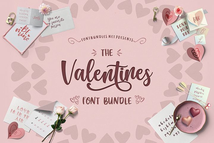
Bonus 2: The Valentine’s Bundle
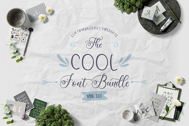
Bonus 3: The Cool Font Bundle
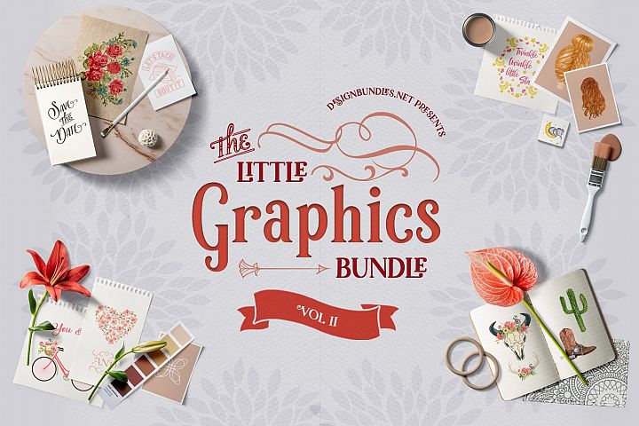
Bonus 4: The Little Graphics Bundle
Bonus 5: Jealous
QUICK TIP: Premium fonts offer designers a chance to achieve a timeless design and are highly recommended for logos and brand identity.
Why Should You Use Google Fonts?
Welcome to what many web designers consider their best friend. Speaking from experience, I can tell you that I rarely embed custom font files onto websites anymore. Google Fonts is now almost exclusively the first and last place I turn to for a website’s typography. Here’s why:
- It’s completely free. Doesn’t matter how many fonts you choose or how many websites you use them on. You’ll never pay a dime.
- As of March 2018, there are over 850 fonts in the library. Chances are you’ll find the right style to match your brand.
- It’s fast. Because the fonts are hosted on Google’s servers, the files are intelligently compressed and designed to load quickly.
- It’s easy. A simple copy-and-paste into an HTML file and you’re done.
- It’s organized. All fonts are categorized and searchable within one database. No more scouring through messy subfolders on your computer to find that perfect font.
- Did I mention it’s free? It’s free!
How to Install Google Fonts
No headaches required here. Just go to Google Fonts and find the font(s) you need.
As you select your fonts they are cumulatively added to a collection at the bottom of the page. When you’re finished with your search, click on that bottom tab and a window with embed instructions will pop up.
Adding Styles
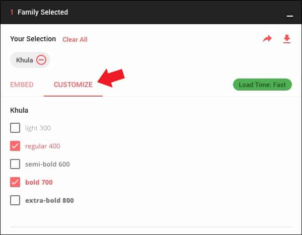
From here you can choose to include additional styling such as italic, bold, bold-italic and so on. Just click on the CUSTOMIZE tab and select the styles you think you’ll need.
For example, here is how I would select both regular and bold text for the font Khula.
Embedding the Standard or @Import?
You’ll notice you have two options for embedding the fonts on your website: using a standard <link href> to be used in your site’s HTML file, or a @import url to be included in your site’s CSS file. So which one should you use?
Generally the best option is to copy and paste the <link href> line into your HTML file. Your fonts will typically load faster this way rather than waiting for the CSS file to load, and this method also has a bit better support for (very) old browsers.
Where to Put the Code
You’re going to copy and paste the line of code Google gives you into the <head> section of your HTML file. So using the Khula font I chose above, it will look like this:
<link href="https://fonts.googleapis.com/css?family=Khula:400,700" rel="stylesheet">
QUICK TIP: You can also specify font styles by writing them out in the url, separated by commas. For example: “https://fonts.googleapis.com/css?family=Khula:bold,italic,bolditalic“
Using the Font in Your Style Sheet
Now you simply call on the font as usual within your CSS code. For demonstration purposes, your main heading and paragraph text could look like this:
h1 {

font-family: ‘Khula’, sans-serif;

font-weight: 700;

font-size: 48px;

}

p {

font-family: ‘Khula’, sans-serif;

font-weight: 400;

font-size: 16px;

}
QUICK TIP: Make sure to include a fallback font such as ‘serif’, ‘sans-serif’ or a similar web safe font in the rare event that your Google Font fails to load.
Advice On Pairing Your Fonts
Deciding which fonts to group together can sometimes be a tricky artistic balance to strike. On the one hand, your font selection will be most effective when there is enough of a contrast in styles; each font on your site must stand out from the others and earn a justification for its use. On the other hand, you don’t want your fonts to stray too far from each other stylistically, which could give the impression they were chosen randomly.
QUICK TIP: Think about what emotion or idea a particular font evokes. Try to pair it with another font that evokes the same emotion or idea. It’s all about finding the right fonts that speak to your unique brand. You’ll know it inherently when a font feels like your brand or whether it’s giving mixed signals.
Serif and Sans-Serif
A tried-and-true method is to pair a serif font with a sans-serif one. Their styles tend to contrast well together, offering an easy distinction between headlines and paragraphs.
Experimentation is Key
When I’m choosing fonts for a new website, I like to download all possible Google Font options to my computer and play with them in a word processing document. Fidgeting with different sizes and weights and comparing the combinations side-by-side is an effective way to determine the best possible pairing. By taking the time to experiment, you may even discover that using a thin variation of a given font makes for better headline text than if you were to use an entirely separate font. (The simplest solution is oftentimes the best.)
Conclusion
Google Fonts is a powerful resource for DIYers who don’t want to pay for expensive custom fonts on their website. But with great power comes great responsibility: typography requires careful thought for it to be done well, and not every font out there is a winner. We hope that this guide helps steer you in the right direction, inspiring you to find that perfect font pairing to capture your brand’s personality.
THE BEHIND THE SCENES OF THIS BLOG
This article has been written and researched following a precise methodology.
Our methodology